Well, that weekend just flew by! We had a few days of unexpected pleasant temps…which means Little Miss’s closet didn’t get cleaned and organized. But I did get to legitimately wear my boots out (for a few hours anyway)! #priorities
As opposed to Friday’s {Now & Later} post…where I wore my boots, but almost lost my life in the process! #overlydramatic (I come from a long line of exaggerators.)
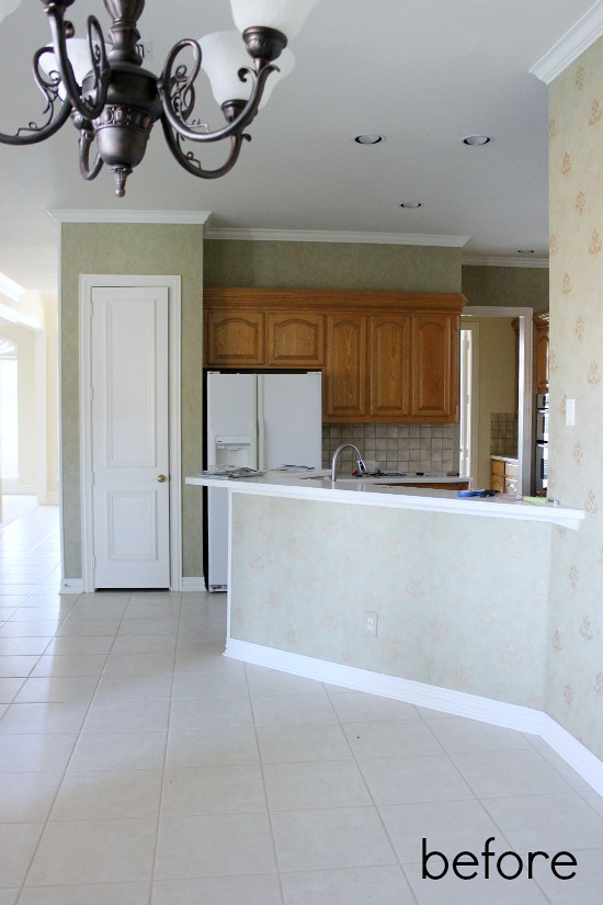
Last month I shared our full Kitchen Reveal…and was thrilled by your kind response. I design our house just for us, because, after all, we’re the ones living here…but that doesn’t mean I don’t feel a little anxious hitting the ‘publish’ button sometimes.
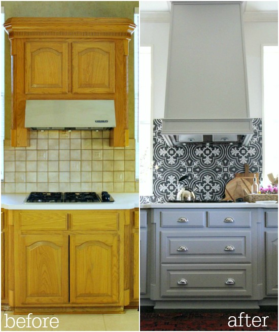
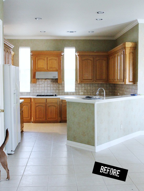
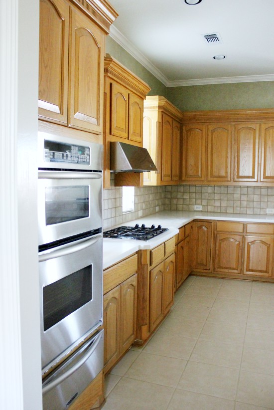
I know my style isn’t for everyone…I mean, hello statement tile…but I try to stay true to us and create a home that makes us happy. But regardless of our design choices, seeing the process can be helpful…so today I’m sharing the Before and After shots, along with a breakdown of our Kitchen remodel.
(Apologies for the jump, but this post is crazy long and photo-heavy!)
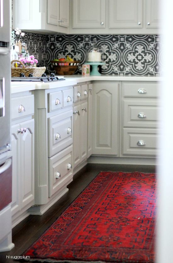
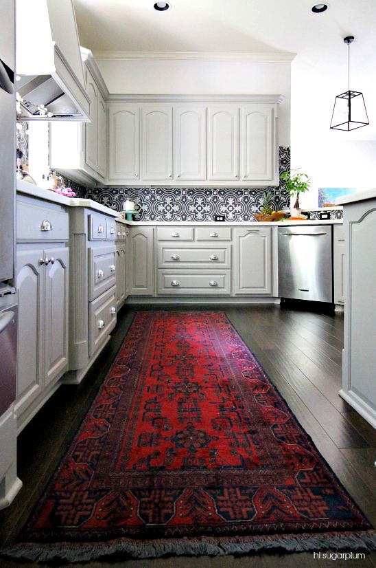
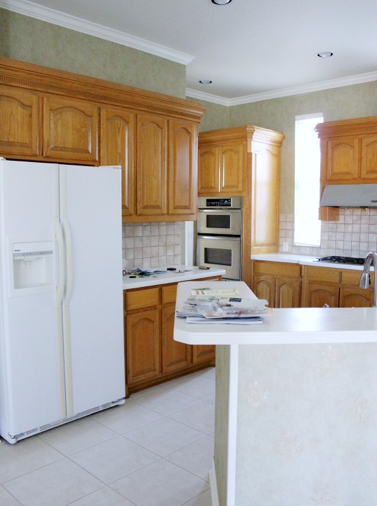
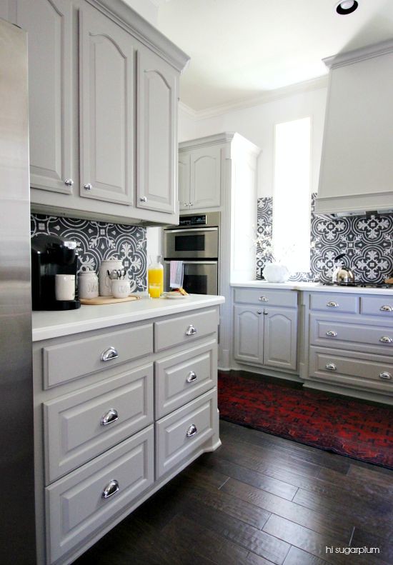
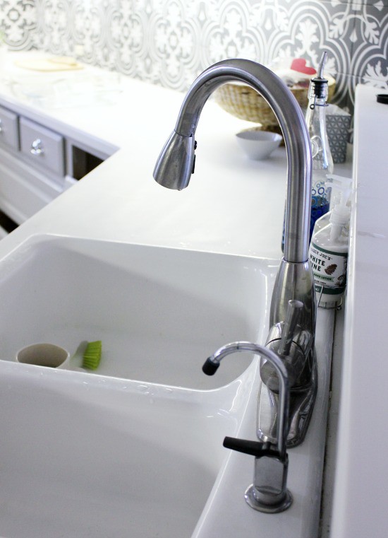
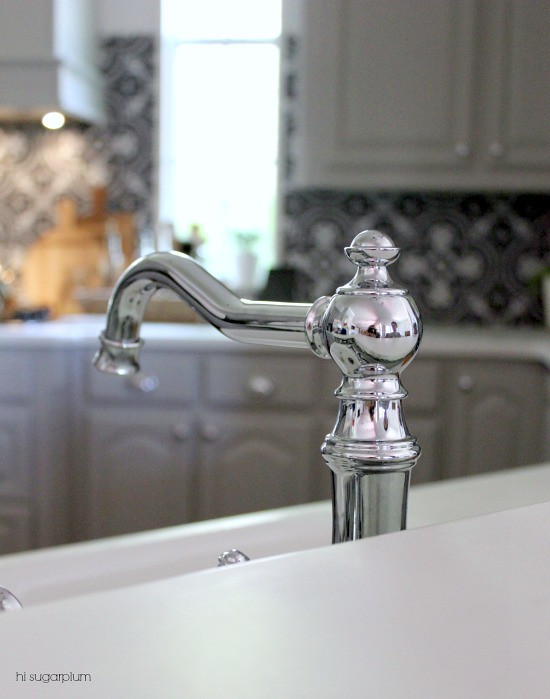
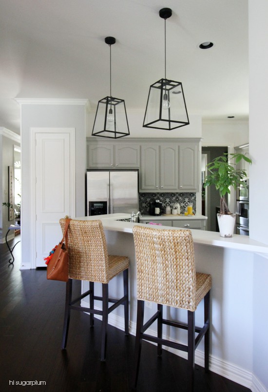
Remodel isn’t quite the right word, because while the transformation is shocking, it’s mostly cosmetic, and the majority of the expense was labor. We didn’t relocate appliances, replace countertops or cabinets, or make any structural changes. We did lay new floors, replace the backsplash, paint the cabinets, and update hardware, faucet, and lighting.


The counters are Corian, which isn’t ideal because of their sensitivity to heat and cold, but I liked the solid white color, and thickness. The Kitchen is quite large (compared to our previous one anyway), so we decided to save the expense and keep the current counters.
We did have them sanded and buffed to remove any stains and scratches…and while that was the biggest mess of the entire process (picture a baby powder explosion), it made them look brand new! The only difference I’ve noticed from not having granite, is I now use a trivet for hot pans and frozen containers.
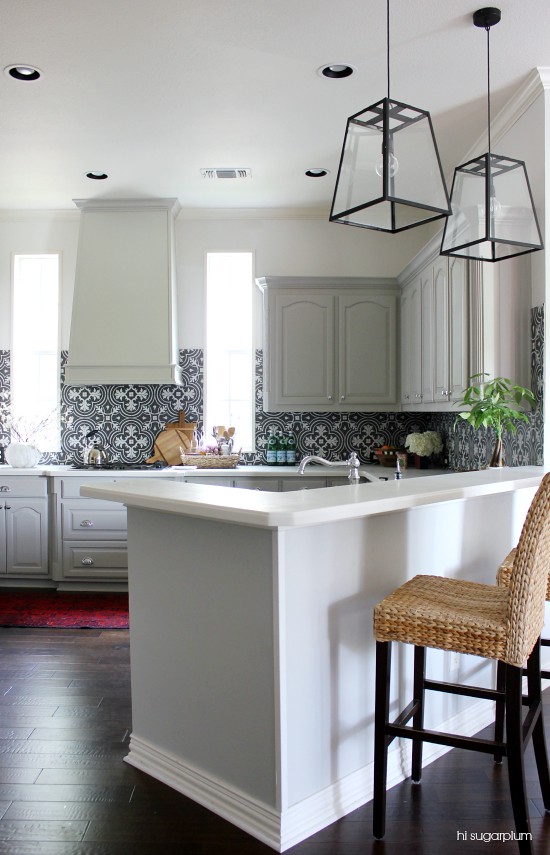
There were some questions about the width of the bar, and if we considered altering it at all. It’s perfectly usable with a 15-inch width, and is standard barstool height. To change that would have meant replacing the counters, or relocating the sink. #budgetbusters


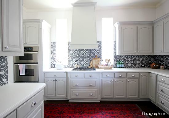
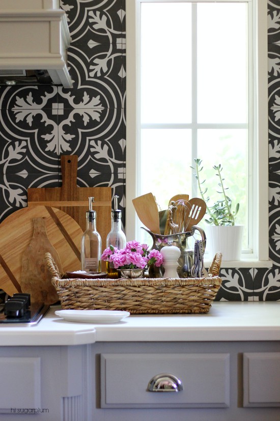
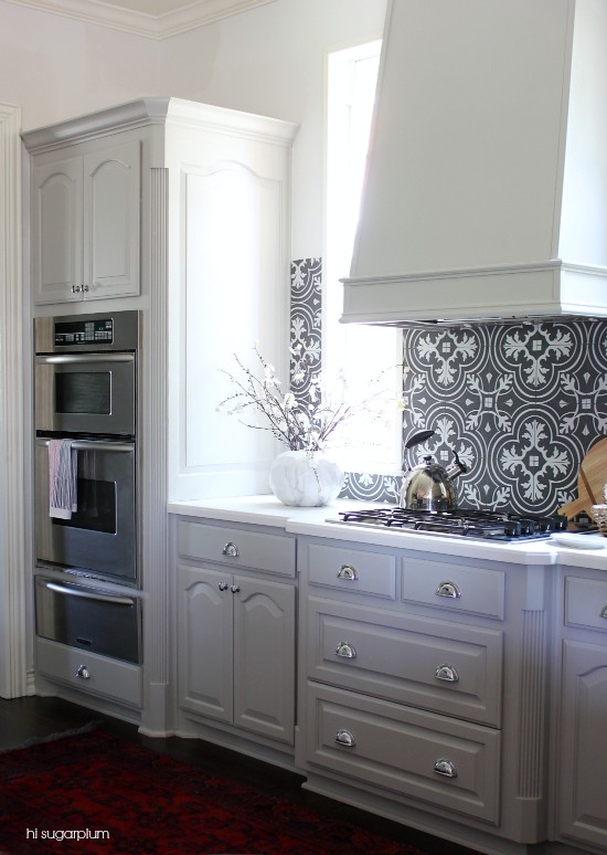
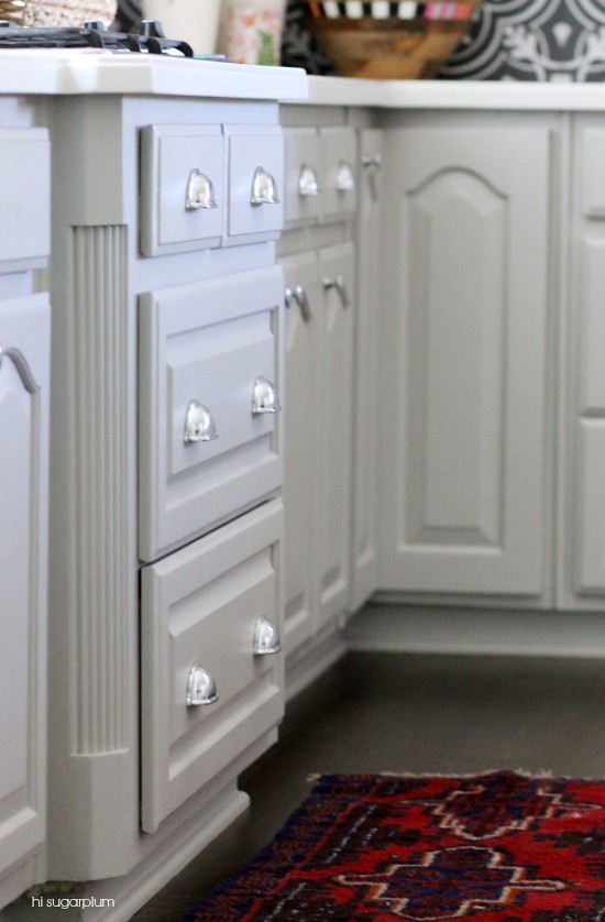
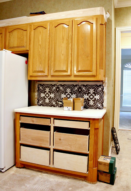
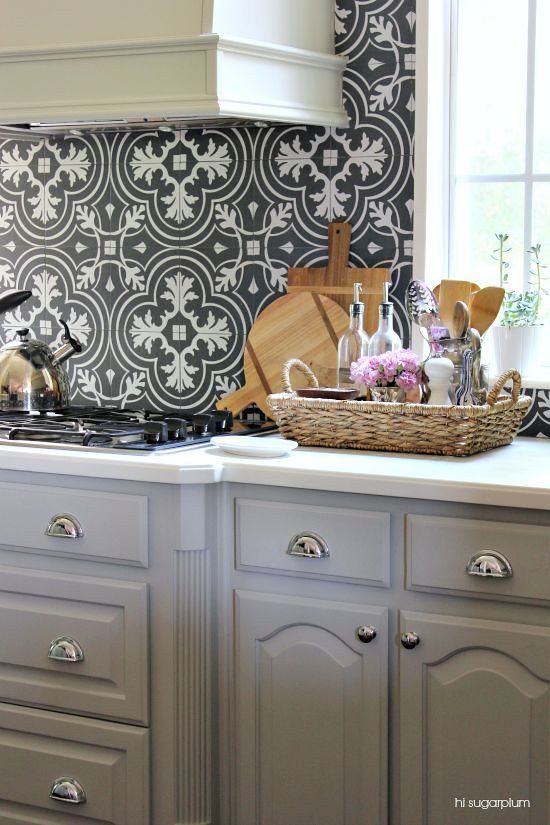
The Kitchen lacked a focal point, so we created one around the stovetop and used the windows to frame it. And to break up the row of cabinets, create more usable storage, and further separate the area, we converted the bottom cabinets to drawers.


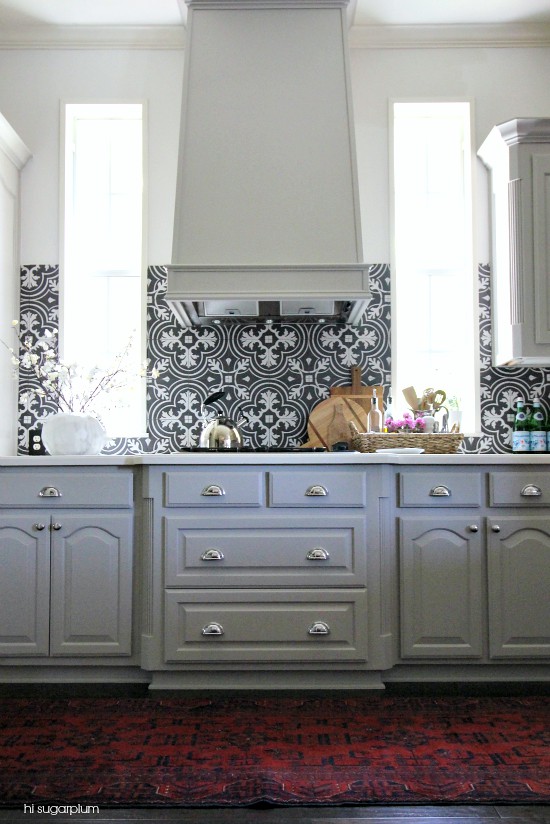
To give the windows more weight and definition, we had them framed and added marble ledges.

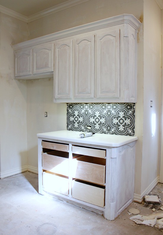
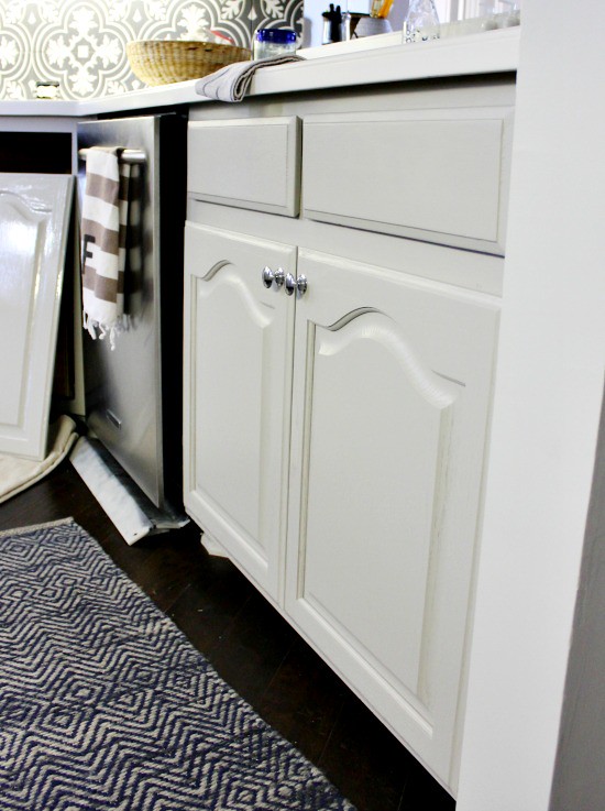
The cabinets were first brushed with two coats of primer, then sprayed with two coats of oil-based paint, mixed with a little paint thinner. By brushing the primer, it filled in the grains of the wood, and left a smooth, even finish.
They taped off the counters and insides of the cabinets, and painted with the doors on. It was by far the stinkiest part of the job, and I couldn’t imagine living in the house during that time.

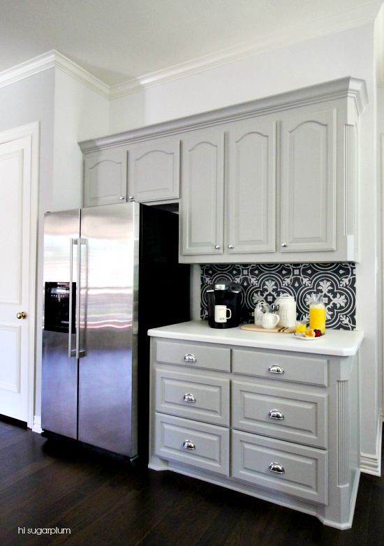
The original vent hood remained, and a box was built around it.


The cabinet crown moulding was a little ornate for our taste (in fact, it was five pieces!), so we replaced it with a simple trim before painting. And converting cabinets to drawers is as simple as removing the cabinet doors, installing tracks and a box, and attaching drawer fronts.
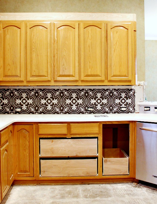

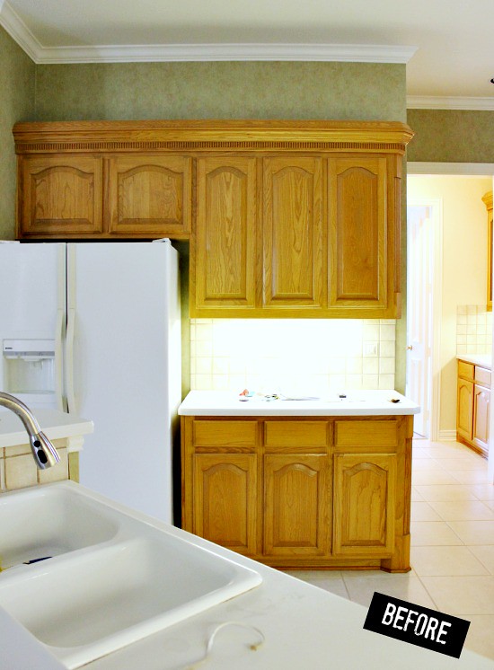
Between the top and bottom cabinets, the Kitchen was a row of doors.

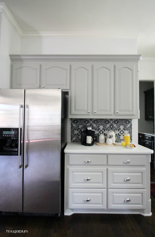
Converting sections of cabinets to drawers helped to break it up, and doubled the storage.
The higher backsplash on the right looks a little odd from this angle, but it’s the same height as the tile on the stovetop wall, so it makes sense when you see the Kitchen as a whole. (That was actually a reader tip, so thank you!!)
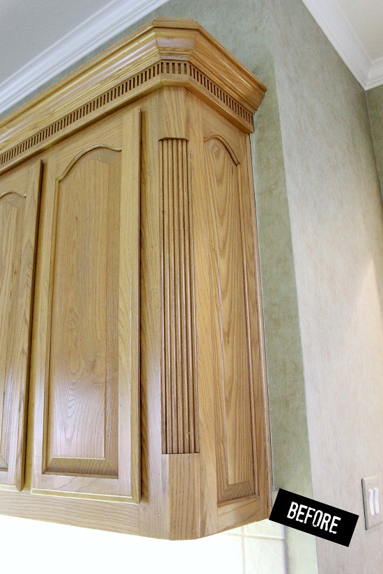
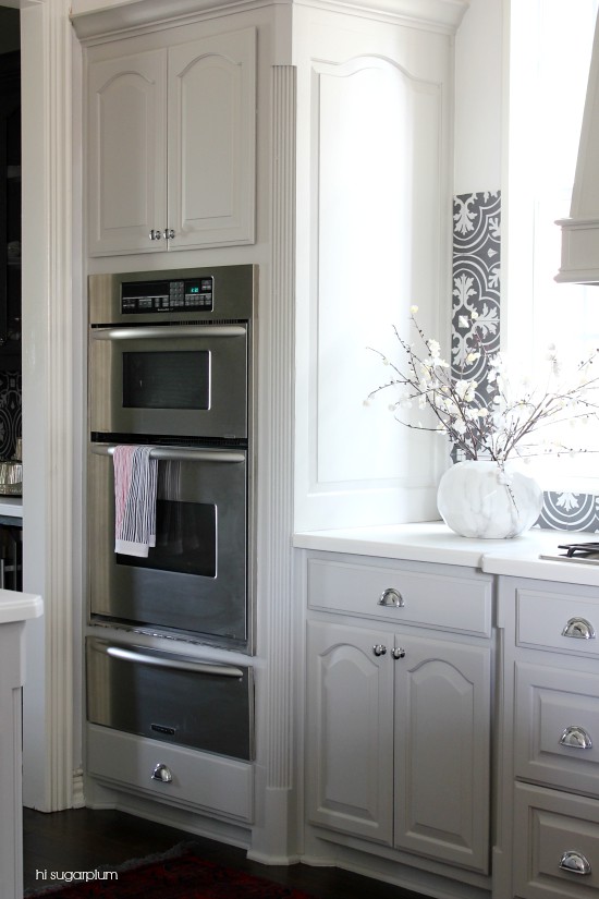
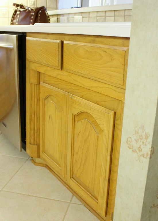
The cathedral doors wouldn’t be my first choice, but they are excellent quality wood, and replacing them seemed a frivolous expense. Paint and hardware gave them an updated look though.
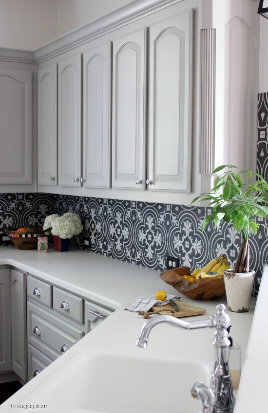
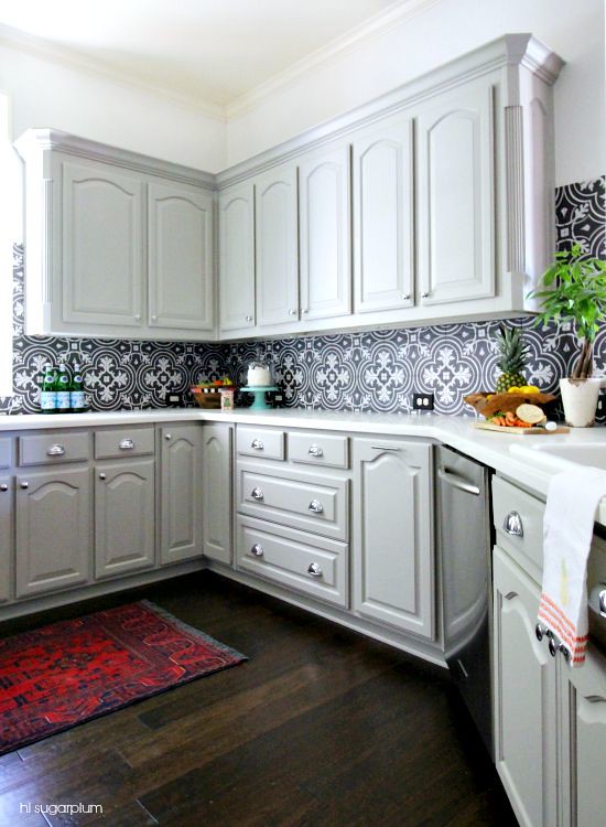

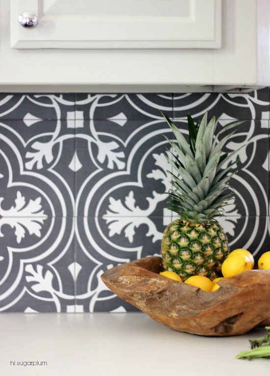
My dream tile was cost-preventative given the amount I needed, so I was thrilled to find this fabulous Look for Less! We used dark grout to not disrupt the pattern, and I sprayed the switch plate and outlet covers dark charcoal. Can you believe I almost wasted this statement tile on the Laundry Room floors?!
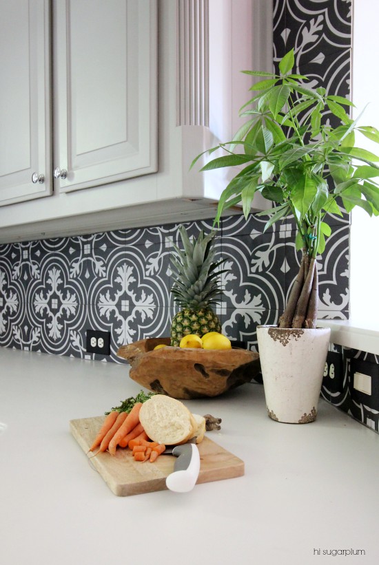
Moving over to the fridge wall…more drawers, backsplash, paint, and a counter-depth fridge (from our last house).


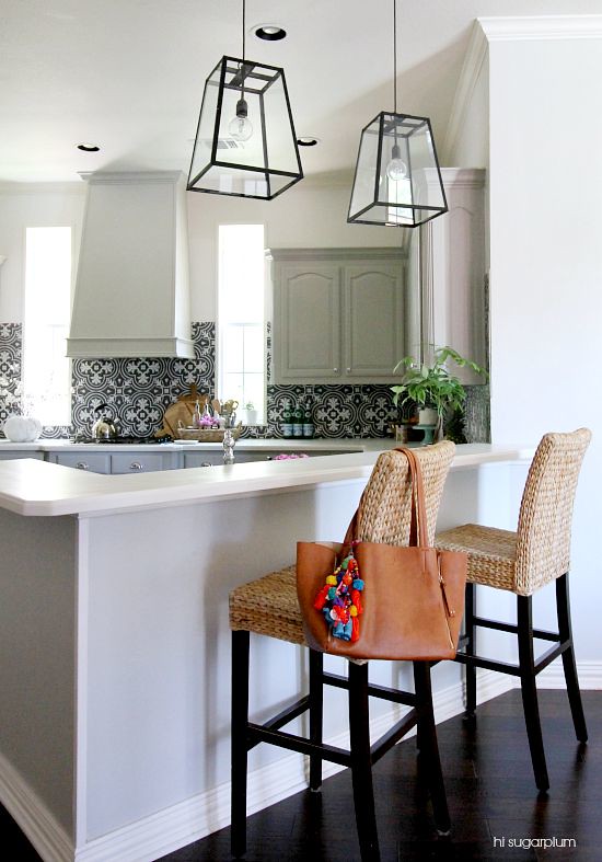
Next up, the sink and breakfast bar area…
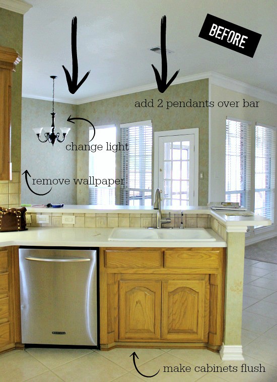


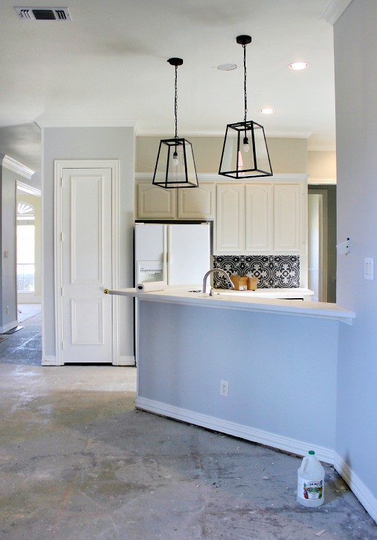
We added the pendant lights to define the bar area, and create visual separation from the adjoining breakfast and family rooms. I’d prefer three barstools, but mine are no longer available, so we’ll eventually replace them.

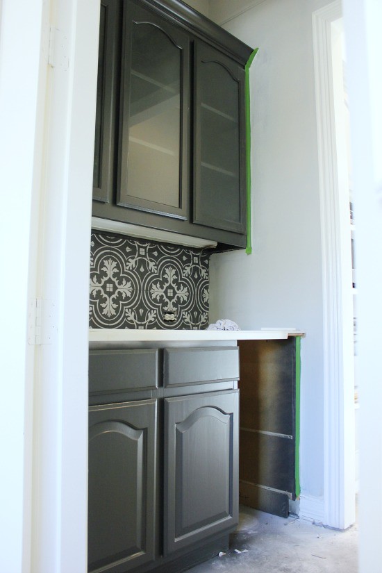
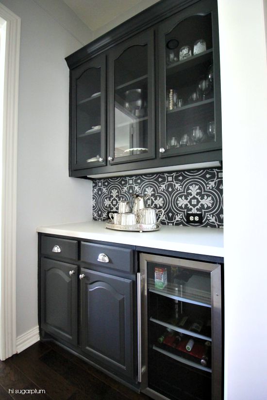
And finally…the butler’s pantry was updated with new moulding, paint, and backsplash.
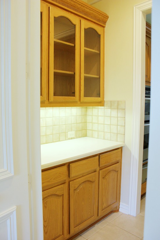

We went with a darker cabinet color to separate it from the main Kitchen, but used the same backsplash for unity. To make the space more than just extra storage, we installed a drink fridge in place of a cabinet. This area will be great for parties. I’m guessing anyway, seeing as how I’ve never had a butler’s pantry!


Sure there are a few things we’d change and do differently if budget weren’t a factor, but I’m thrilled with the new room, and feel it reflects us perfectly. Sometimes a space just needs a little love, not a lot of money, for a complete transformation. And a rocking contractor.
Whew, that was a doozy of a post! I hope you enjoyed the Before & Afters…and thank you for following the remodel along with me! If you have additional questions, feel free to leave them in the comments and I’ll answer them there. Now, on to the next room! Happy Monday, lovebugs!
P.S. If you’re in the Dallas area and looking for a reliable, honest, hard-working, fairly-priced contractor…shoot me an email, I’m happy to share his contact info!